 Youtube Link
Pin One Element to Scroll Until Bottom of Second Element

In the vast landscape of web design, certain features can elevate user experience to new heights. One such feature is the combination of scrollable sections and sticky columns, providing a seamless and intuitive browsing experience. In this article, we'll delve into the intricacies of implementing scrollable sections and sticky columns using React and CSS, empowering you to enhance your website's usability and engagement.
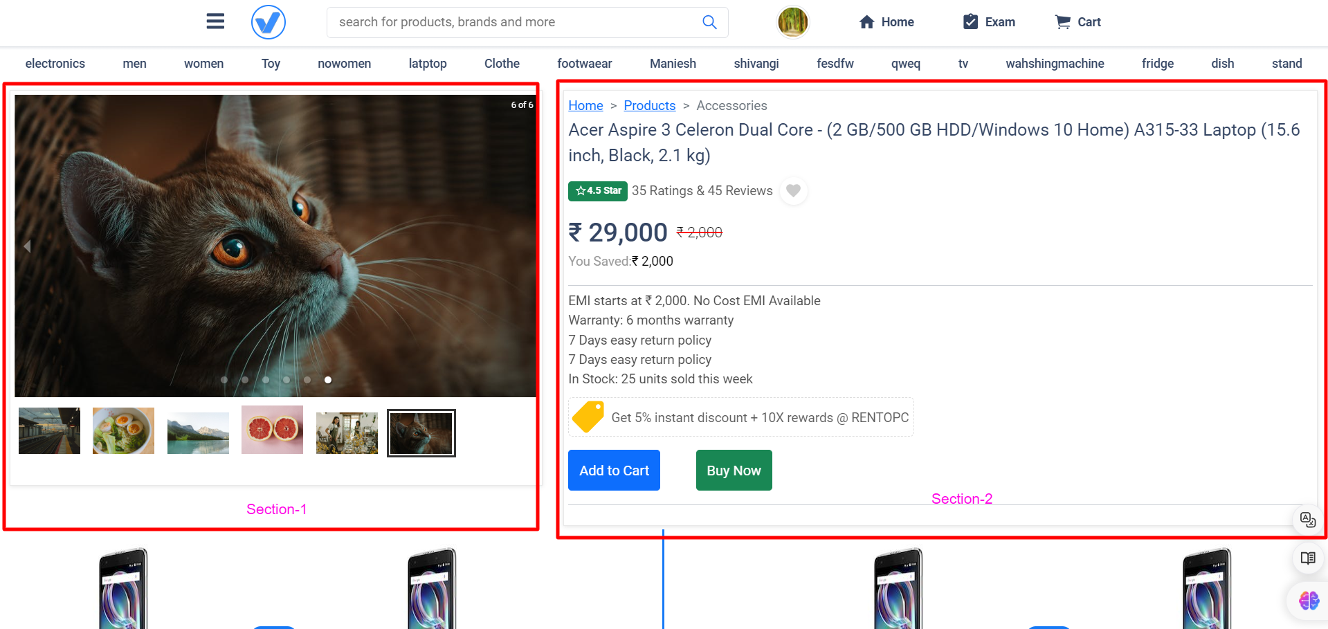
Understanding Scrollable Sections: Scrollable sections are essential for enabling users to navigate through content seamlessly, particularly in lengthy web pages. They offer a structured and organized browsing experience, allowing users to consume information at their own pace. By leveraging React and CSS, developers can implement scrollable sections with ease, offering flexibility and customization options to tailor the experience to users' needs.
Exploring Sticky Columns: Sticky columns play a vital role in keeping essential content visible as users scroll. Whether it's navigation menus, sidebars, or call-to-action elements, sticky columns ensure that important information remains within reach, enhancing user engagement and reducing friction in the browsing experience. By dissecting the provided code snippet, we'll gain insights into how sticky columns are implemented and customized using React and CSS.
Creating a Seamless User Experience: The synergy between scrollable sections and sticky columns is key to creating a seamless user experience. By combining these features, websites can enhance navigation, readability, and overall user engagement. Real-world examples will illustrate how scrollable sections and sticky columns work together to optimize user experience, inspiring you to implement these techniques in your own web projects.
Understanding the Code:
Let's break down the following React code snippet:
import React, { useEffect, useState } from 'react';
import reactLogo from "./assets/react.svg";
import "./App.css";

function App() {
    // State to track whether section 1 should be fixed
    const [isSection1Fixed, setIsSection1Fixed] = useState(false);

    useEffect(() => {
        // Function to handle scroll events
        const handleScroll = () => {
            // Get references to section 1 and section 2
            const section1 = document.getElementById('section-1');
            const section2 = document.getElementById('section-2');

            // Get the top offset of section 1 and section 2
            const section1Top = section1.offsetTop;
            const section2Top = section2.offsetTop;

            // Get the current scroll position
            const scrollTop = window.scrollY || document.documentElement.scrollTop;

            // Determine if section 1 should be fixed
            if (scrollTop > section1Top) {
                if (scrollTop < section2Top - window.innerHeight) {
                    setIsSection1Fixed(true);
                } else {
                    setIsSection1Fixed(false);
                }
            } else {
                setIsSection1Fixed(false);
            }
        };

        // Add event listener for scroll events
        window.addEventListener('scroll', handleScroll);

        // Clean up by removing event listener when component unmounts
        return () => {
            window.removeEventListener('scroll', handleScroll);
        };
    }, []); // Empty dependency array ensures the effect runs only once on component mount

    return (
        <>
            {/* Sticky Header */}
            <div className='header'>Sticky Header</div>

            {/* Two-item container for left and right columns */}
            <div className='two-item-container'>
                {/* Left column */}
                <div id='sticky' className='item-one'>
                    {/* Content goes here */}
                </div>

                {/* Right column */}
                <div id='section-1' className={`item-two ${isSection1Fixed ? 'fixed-section' : ''}`}>
                    {/* Content goes here */}
                </div>
            </div>

            {/* Scrolling section */}
            <div id='section-2' className="another-section">
                {/* Content goes here */}
            </div>
        </>
    );
}

export default App;
In this code:
- We import necessary dependencies, including React, icons, and CSS styles.
- We define a functional component
App. - We use the
useStatehook to manage the state ofisSection1Fixed, which determines whether the left column (section 1) should be fixed. - We use the
useEffecthook to add an event listener for scroll events. Inside the effect, we calculate the scroll position and determine whether section 1 should be fixed. - We return JSX, which includes the sticky header, two-item container with left and right columns, and a scrolling section.
Now, let's delve into the CSS styles:
.header {
    width: 100%;
    height: 56px;
    background: #72a24d;
    top: 0;
    position: sticky; /* Keeps the header fixed at the top */
    z-index: 999;
    padding-left: 12px;
    padding-right: 12px;
}

.two-item-container {
    position: relative;
    margin-top: 50px; /* Ensures space below the sticky header */
    display: flex;
    flex-direction: row;
}

.item-one {
    width: 50%;
    background: #000;
    height: 500px;
}

.item-two {
    width: 50%;
    background: #970f0f;
}

.another-section {
    background: #136322;
}

@media (min-width: 768px) {
    .item-one {
        position: sticky; /* Makes the left column sticky on larger screens */
        top: 56px; /* Ensures it starts below the header */
    }
}
Here's what each CSS rule does:
.header: Styles the sticky header with a background color, fixed position, and padding..two-item-container: Sets up the layout for the two-column structure using flexbox..item-oneand.item-two: Styles the left and right columns with background colors and dimensions..another-section: Styles the scrolling section with a background color.@media (min-width: 768px): Applies additional styles to the left column for larger screens, making it sticky below the header.
Determine if section 1 should be fixed
Let's break down the logic behind this conditional statement:
if (scrollTop > section1Top) {
    if (scrollTop < section2Top - window.innerHeight) {
        setIsSection1Fixed(true);
    } else {
        setIsSection1Fixed(false);
    }
} else {
    setIsSection1Fixed(false);
}
This code is responsible for determining whether the left column (section 1) should be fixed/sticky based on the user's scroll position.
Here's the breakdown of each part:
-
Outer Condition:
if (scrollTop > section1Top) {This condition checks if the current scroll position (
scrollTop) is greater than the top offset of section 1 (section1Top). In other words, it checks if the user has scrolled past the point where section 1 should become sticky. -
Inner Condition:
if (scrollTop < section2Top - window.innerHeight) {Inside the outer condition, this inner condition checks if the current scroll position is less than the top offset of section 2 (
section2Top) minus the height of the viewport (window.innerHeight). This condition ensures that section 1 remains sticky until the top of section 2 approaches the bottom of the viewport. In other words, it checks if section 1 should remain sticky within the viewport's boundaries. -
Setting State:
- If both conditions are met (i.e., the user has scrolled past section 1 and hasn't reached section 2 yet),
setIsSection1Fixed(true)is called. This means that section 1 should be fixed/sticky. - If the inner condition is not met (i.e., the user has scrolled past section 2 or reached the bottom of the viewport),
setIsSection1Fixed(false)is called. This means that section 1 should not be fixed/sticky. - If the outer condition is not met (i.e., the user hasn't scrolled past section 1),
setIsSection1Fixed(false)is called. This ensures that section 1 is not fixed/sticky when the user hasn't scrolled past it.
- If both conditions are met (i.e., the user has scrolled past section 1 and hasn't reached section 2 yet),
-
Fallback:
} else {
    setIsSection1Fixed(false);
}
If the outer condition is not met (i.e., the user hasn't scrolled past section 1), this fallback ensures that
isSection1Fixedis set tofalse. This handles the case where the user scrolls back up above section 1, ensuring that it's not fixed/sticky in that scenario.
This conditional statement dynamically updates the state isSection1Fixed based on the user's scroll position, ensuring that section 1 becomes sticky when needed and returns to its default position when appropriate.
Related Questions-
1-ScrollTrigger: Responsive Pin with Horizontal Scroll without (GSAP)
2- How to set scrolling on product page just like flipkart?
3- How can I make a div scroll with page and stop at footer?
Conclusion: In conclusion, scrollable sections and sticky columns are powerful tools for improving usability and engagement on websites. By understanding the intricacies of their implementation using React and CSS, you can elevate your website's user experience to new heights. We encourage you to experiment with these features in your projects and embrace the transformative impact they can have on user satisfaction and retention.