 Youtube Link
Horizontal Scrolling Card Slider in React JS with Backward Arrow and Forward Arrows

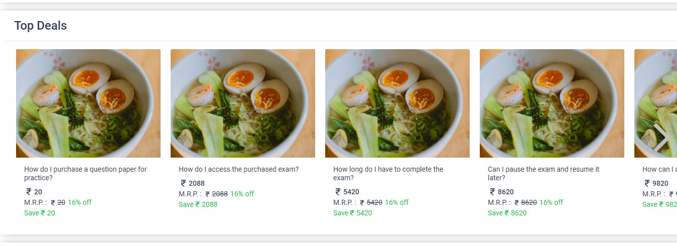
In this section, we will learn how to create a responsive horizontal scrolling card slider in ReactJS without using any library. The slider will allow us to display a set of cards horizontally and scroll through them using navigation arrows. We will implement this using React components and CSS.
Preview -
Introduction
Card sliders are a popular UI component used to showcase multiple items within a limited space. They are commonly used in e-commerce websites to display product listings, featured items, or recommended products. By making the slider horizontally scrollable, we can accommodate a larger number of cards without cluttering the screen.
Features
Before we dive into the implementation, let's outline the features of our card slider:
- Interactive functionality: Users can scroll through the cards using navigation arrows.
- End-of-scroll detection: The slider will detect when it reaches the end, disabling the forward arrow.
- Set default state on the first-time load: The slider will initialize at the beginning.
- Reusable Component: The component will be reusable and easily customizable.
Implementation Steps
Step 1: Set up the project
To get started, create a new ReactJS project using your preferred setup (e.g., Create React App).
Prerequisite library for your project-
- Install react-bootstrap
- Install react-icons
Note- You can change or remove above the library as per your convenience.
Step 2: Create the ItemsSlider component
In your project under src, create a new file named ItemsSlider.jsx. This file will contain the code for our card slider component.
import React, { useState, useRef } from 'react';
import './style.css';
import { MdArrowForwardIos, MdArrowBackIos } from "react-icons/md";
import { Container } from 'react-bootstrap';

const ItemsSlider = ({ title, children }) => {
  let scrl = useRef(null);
  const [scrollX, setscrollX] = useState(0);
  const [scrollEnd, setScrollEnd] = useState(false);

  const slide = (shift) => {
    scrl.current.scrollBy({
      left: shift,
      behavior: 'smooth'
    });

    scrl.current.scrollLeft += shift;
    setscrollX(scrollX + shift);
    if (Math.floor(scrl.current.scrollWidth - scrl.current.scrollLeft) <= scrl.current.offsetWidth) {
      setScrollEnd(true);
    } else {
      setScrollEnd(false);
    }
  };

  const scrollCheck = () => {
    setscrollX(scrl.current.scrollLeft);
    if (Math.floor(scrl.current.scrollWidth - scrl.current.scrollLeft) <= scrl.current.offsetWidth) {
      setScrollEnd(true);
    } else {
      setScrollEnd(false);
    }
  };

  return (
    <Container fluid className='my-3 py-3 item-slider-container'>
      <h4 className='px-3 mb-3 item-title'>{title}</h4>
      <div className='item-slider'>
        <div onClick={() => slide(-100)} className={`left-arrow-left ${(scrollX < 1) ? 'is-disabled-hide' : ''}`}>
          <MdArrowBackIos size="70px" />
        </div>
        <div ref={scrl} onScroll={scrollCheck} className="item-container">
          {children}
        </div>
        <div className={`right-arrow-right ${(!scrollEnd) ? '' : 'is-disabled-hide'}`} onClick={() => slide(+100)}>
          <MdArrowForwardIos size="70px" />
        </div>
      </div>
    </Container>
  );
};

export default ItemsSlider;
Step 3: Style the component
Next, create a CSS file named style.css to style our component ItemsSlider.jsx. It is imported in the ItemsSlider.jsx file.
.item-slider-container {
  background-color: var(--sp

-background-color);
  box-shadow: 0px 0px 16px -8px rgb(0 0 0 / 68%);
}

.item-slider-container .item-title {
  border-bottom: 1px solid rgba(0, 0, 0, .1);
  padding-bottom: 15px;
}

.item-slider {
  padding: 0px 5px;
  justify-content: space-between;
  align-items: center;
  display: flex;
  position: relative;
}

.item-slider .item-container {
  display: inline-flex;
  justify-content: flex-start;
  overflow-x: scroll;
  padding: 0px 5px;
}

.item-slider .item-container span {
  margin: 0px 10px;
}

.item-slider .item-container::-webkit-scrollbar {
  display: none;
}

.item-slider .left-arrow-left {
  position: absolute;
  left: 15px;
  cursor: pointer;
  z-index: 1;
}

.item-slider .right-arrow-right {
  position: absolute;
  right: 0px;
  cursor: pointer;
  z-index: 1;
}

.right-arrow-right>svg,
.left-arrow-left>svg {
  color: #c3c3c1;
}

.right-arrow-right svg:hover,
.left-arrow-left svg:hover {
  color: #5b5b5b;
  border-radius: 50%;
}

/* Card item styles */
.item-container .card {
  border: unset;
}

.item-container .card-title {
  font-size: 14px;
  font-weight: normal;
}

.item-container .card span {
  padding: 0;
  margin: 0;
}

.item-container .card .mrp-price {
  font-size: 14px;
  font-weight: normal;
  display: flex;
  justify-content: flex-start;
  align-items: center;
  gap: 5px;
}

.item-container .card .save-price {
  font-size: 14px;
  display: flex;
  justify-content: flex-start;
  align-items: center;
  color: var(--sp-exam-button-color);
}

.item-container .card .actual-price {
  font-size: 14px;
  font-weight: 500;
  display: flex;
  justify-content: flex-start;
  align-items: center;
}
Step 4: Use the component
Now, you can use the ItemsSlider component in your desired component by importing it and passing the necessary props. For Example - Here I am importing it app.jsx,
import React from 'react';
import { Card } from 'react-bootstrap';
import { BiRupee } from 'react-icons/bi';
import ItemsSlider from './ItemsSlider';

const App = () => {
  const topDealsItems = [
    { title: 'Item 1', price: 10 },
    { title: 'Item 2', price: 20 },
    { title: 'Item 3', price: 30 },
    // Add more items as needed
  ];

  return (
    <ItemsSlider title="Top Deals">
      {topDealsItems.map((item, index) => (
        <span key={index}>
          <Card style={{ width: '18rem' }}>
            <Card.Img variant="top" src={item.image} />
            <Card.Body>
              <Card.Title>{item.title}</Card.Title>
              <Card.Text>
                <span className='actual-price'><BiRupee size={20}/> {item.price}</span>
                <span className='mrp-price'>M.R.P. : <strike><BiRupee size={16} color={818181} />{item.price}</strike><span className='save-price

'>16% off</span></span>
                <span className='save-price'>Save<BiRupee size={16}/>{item.price}</span>
              </Card.Text>
            </Card.Body>
          </Card>
        </span>
      ))}
    </ItemsSlider>
  );
};

export default App;
Conclusion
In this section, we have learned how to create a responsive horizontal scrolling card slider in ReactJS. By following the steps outlined above, you can implement this feature in your own ReactJS projects. Feel free to customize the styles and adapt the code to fit your specific requirements. Happy coding!