 Youtube Link
Create a responsive multiple card with equal size and height using Html, CSS and React

In modern web design, it is crucial to create responsive and visually appealing layouts that work across various devices. One of the most popular design elements is cards that can be used to display various types of content in a compact and visually pleasing way. In this blog, we will walk through how to create a responsive multiple card with equal size and height using HTML, CSS, and React.
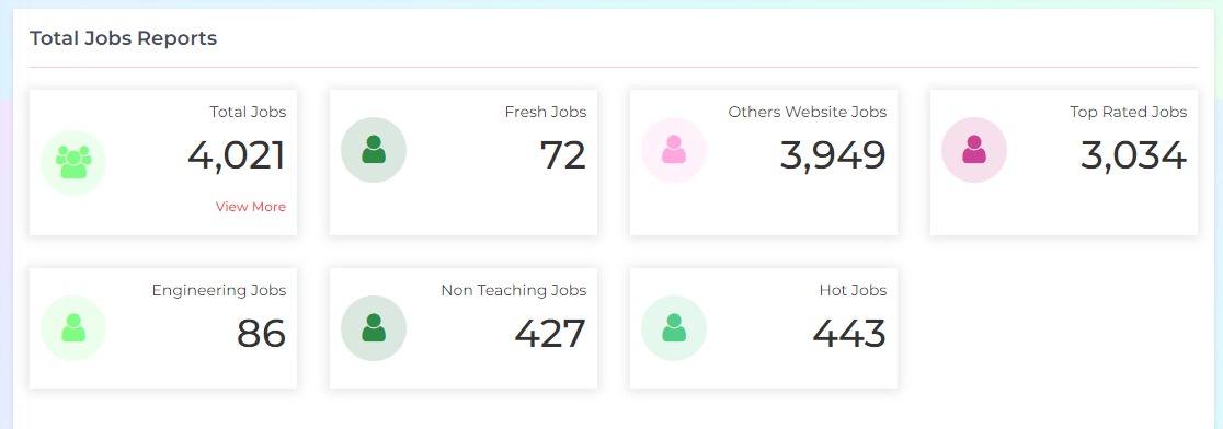
Preview-
Step 1: Setting up the React Environment
To create the card, we will be using React, a popular JavaScript library for building user interfaces. Before we start, make sure you have Node.js and create-react-app installed on your machine. Open your command line and create a new React project with the following command:
npx create-react-app card-demo
This will create a new React project in a folder called 'card-demo'. To test that everything is set up correctly, navigate to the 'card-demo' directory and run the following command:
npm start
This will start the development server and open a new browser window with the default React app.
The folder structure of card-demo looks like this -
Step 2: Creating the HTML Structure React Component
Now that we have our React project set up, we can start building our card component. Create a new file called 'ManyCard.js' in the 'src' directory and add the following code:
import React from 'react';
import { Button, Card } from 'react-bootstrap';
import CountUp from "react-countup";
import "./styles.css"

const ManyCard = ({ count, title, onClick, iconColor, className, bgColor }) => {

  return (
    <>
      {/* <div className="box-container"> Use this where you import this component */ }
      <li href="#" data-toggle="" aria-expanded="true" onClick={onClick}>
        <Card>
          <Card.Body>
            <span className="dash-widget-icon" style={{ color: iconColor, backgroundColor: bgColor }}>
              <i className={`${className}`}></i>
            </span>
            <div className="dash-widget-info">
              <Card.Text>
                {title}
              </Card.Text>
              <Card.Title><h1>
                <CountUp
                  start={0}
                  end={count}
                  duration={1}
                  separator=","
                />
              </h1>
              </Card.Title>
              <h6 style={{ color: "var(--button-bg-color)" }}>{onClick ? "View More" : ""}</h6>
            </div>
          </Card.Body>
        </Card>
      </li>

     {/*</div> End of box-container div*/ }
    </>
  )
}

export default ManyCard;
The ManyCard component takes in several props such as count, title, onClick, iconColor, className, and bgColor. These props are used to customize the appearance and functionality of the component.
The component returns a li element containing a Card component from the react-bootstrap library. The Card component provides a structured way of displaying content with multiple sections, such as a header, body, and footer.
The Card component contains a Card.Body component, which contains the main content of the card. The content includes a title, count, and an optional "View More" button that can be clicked to trigger a function passed in as a prop.
The count value is displayed using the CountUp component from the react-countup library. This component animates the count value from 0 to the specified count prop value over a duration of 1 second. The separator prop is used to display the count value with commas for readability.
The code also includes a separate CSS file called styles.css that defines the styles for the ManyCard component.
Step 3: Creating creating the styles.css
.box-container {
    position: relative;
    padding: 5px 15px;
    width: 100%;
  }

  .box-container > ul {
    display: flex;
    flex-wrap: wrap;
    padding: 0px 0px 30px 0px;
    margin: 0px -30px 0px 0px;
    gap: 30px;
  }

  .box-container ul li {
    background-color: var(--background-color);
    padding: 10px;
    flex-basis: calc(25% - 30px);
    box-shadow: 0px 1px 10px 2px rgb(0 0 0 / 10%);
  }

  .box-container .card-body {
    position: relative;
    display: flex;
    justify-content: space-between;
    align-items: center;
  }
  .dash-widget-icon {
	background-color: #eee;
	border-radius: 100%;
	color: #777;
	display: inline-block;
	float: left;
	font-size: 30px;
	height: 60px;
	line-height: 60px;
	margin-right: 7px;
	text-align: center;
	min-width: 60px;
}
  .dash-widget-info p {
    font-size: 14px;
  }

  .box-container ul li:hover {
    background-color: var(--sidebar-active-background);
    padding: 10px;
    color: var(----sidebar-active-color);
    box-shadow: 0 2px 5px 0 rgb(0 0 0 / 10%);
    cursor: pointer;
  }

  .box-container ul li:hover h1 {
    color: var(--sidebar-active-color);
  }

  @media (min-width: 1200px) {
    .box-container ul li {
      flex-basis: calc(25% - 30px);
    }
  }
  @media (max-width: 1200px) {
    .box-container ul li {
      flex-basis: calc(33.333% - 30px);
    }
  }

  @media (max-width: 767.98px) {
    .box-container ul li {
      flex-basis: calc(50% - 30px);
    }
  }

  @media (max-width: 576px	) {
    .box-container ul li {
      flex-basis: calc(100% - 30px);
    }
  }
This is a CSS code snippet for a responsive box container that contains a list of items displayed in a flex layout with a card-like design. The code uses media queries to adjust the item's width based on the device screen size. The hover effect changes the background color, text color, and adds a box shadow. The card body contains an icon and text information with a font size of 14px.
Step 4: Use above ManyCard component in the App.js
To display information in a visually appealing way, I decided to use the ManyCard component in my React application.
First, I imported the component using the following code to my app.js:
import { ManyCard } from './ManyCard.js';
Then, I added the component to my app.js:
<ManyCard
  count={department}
  title="Total Departments"
  className="fa fa-users"
  onClick=""
  iconColor="#fea7df"
  bgColor="#fff2fa"
/>
Here is the complete aap.js code
import React from 'react';
import { Route, Routes } from 'react-router-dom';
import { ManyCard } from './ManyCard.js';

const BaseUrl = 'http://localhost:3000/';

function App() {
  return (
    <div className="App">
      {/* This is ManyCard component */}
      <div className="box-container">
        <ul>
          <ManyCard
            count={department}
            title="Total Departments"
            className="fa fa-users"
            onClick=""
            iconColor="#fea7df"
            bgColor="#fff2fa"
          />
        </ul>
      </div>

      <Routes>
        <Route path="/" element={<Home/>} />
      </Routes>
    </div>
  );
}

export default App;
In this blog, we discussed the importance of responsive design in web development and how it can benefit businesses by improving user experience and increasing engagement. We also talked about some best practices for creating responsive designs, such as using media queries, optimizing images, and using fluid layouts.
To demonstrate how responsive design can be implemented, we looked at a sample code snippet for a React app that uses the ManyCard component to display data on the web page. We showed how the component can be customized and passed data props such as count, title, and iconColor to display dynamic information on the page.
There are three files ManyCard.js, app.js and styles.css.
1- Import styles.css in ManyCard.js like this (It depends the folder locaton under src)
import "./styles.css"
2- Import ManyCard.js component in app.js or any other component like this (It depends the folder locaton under src)
import { ManyCard } from './ManyCard.js';